
TONAL PATTERNS (aka NOTAN STUDIES)
Some artists configure their tonal patterns by utilizing vague letter shapes, the goal being to subliminally guide the viewer’s eye within the artwork following a universally recognizable path (of course, eastern artists traditionally utilized different paradigms for composing). Some examples of these letters are L, J, C, H. X, F, T. Look for examples as you browse artists’ work. You’ll find that some artists have favourites, and others don’t follow a typical pattern. Below are some basic tonal configurations used in landscape painting. Each of the patterns has different configurations of the basic tonal areas: light, medium and dark.)


IN IMAGE 1 - we have a nice feature tree, and some water reflections, let’s do a notan of just how the reference appears now.

NOTAN STUDIES
The term NOTAN, is a Japanese word meaning “dark, light,” and refers to the massing of tones or values. Notan-beauty means the harmony resulting from the combination of dark and light spaces—whether coloured or not—whether in buildings, in photos, designs, any art or in nature.
Did you ever wonder what makes a master painter? Many areas need to be conquered of course, but one of the vital areas to become familiar with (for all genres) is the element of value and the part it plays in achieving your design principles. (If you have not studied the elements and principles of design yet, now might be a good time)
To get a grasp on value patterns, a student of drawing and painting must do at least two things really well:
1/ squint very effectively to be able to 'see' just two to three value levels
2/ Always do a quick notan study as a part of the compositional plan before undertaking any artwork.
BELOW ARE SOME IMPORTANT EXERCISES TO HELP YOU 'SEE', ASSESS AND CONSTRUCT SOME NOTAN PATTERNS. HERE IS AN EXAMPLE.
IN IMAGE 2 - I have used photoshop to quickly break down this image into two tonal levels. (if you have a version of this software, use the Threshold adjustment for two value breakdowns or the Posterise {+de-saturate or greyscale} for three or more.)
You can do a similar thing with some test images, by squinting to visualise just two main values areas (dark and light), then do a small thumbnail sketch of the abstract pattern you see, just a quick simple one.
It is after this point that you can use all that you know about design and compositional arrangement to adjust this value pattern. In this case, I found that the design was horizontally split into almost even parts, so I make the decision that the foreground water area will dominate more because the reflections are what I am loving. Now. see the second image below, my new 4-tone notan study which ensures that this is adjusted.
At the same time, I have used an altered ratio of rectangle for my notan study which reflects the proportions of the canvas on which I will create my artwork, killing two birds with one stone.
I feel that the positive and negative spaces are balanced now, and I have decided that the position for my focal point (where I will engineer the highest value contrast will be the trunk of the main tree.) IMAGE 3

IN THE LAST IMAGE - I will take it back a step further now and look at a 5-value study. To further ensure I am fulfilling my goals and principles in design, I now can adjust the overall value balance as follows.
Medium - a lot
dark - some
light - a little
It could have been any number of combinations but notice that none of the 3 broad value measures are equal. (just as with other elements eg colours and temperatures, I will ensure that no two intervals are the same). Now squint hard at this 5-value study and you can see it looks a lot like the 2-value study. Your reference may not have a decent value range or an effective value pattern, this is why a student artist needs to learn to create and compose, not copy.
BELOW ARE SOME EXAMPLES OF NOTAN STUDIES
Remember, as you study these images for notan possibilities, keep an eye out for broad value patterns and shapes. The most successful notan studies :(keep in mind exceptions to every “rule” exist, these are broad guidelines)
- are easily and quickly navigated by the eye (i.e. not jumping all over from individual shape to shape)
- have a maximum of 3-7 main separate shapes seen on squinting
- the lights and darks are NOT in the same proportions
- both the light and dark shapes need to have some interest
- the viewer’s eye is guided within the frame but not led out
- the most successful notan patterns achieve a sense of balance and harmony.
EXAMPLE ONE - LANDSCAPE
First, look at this painting by Constable ' The Hay Wain', and below a 2 value notan study. (Squint at the painting to break it down to just two shapes, one dark (more) and one light.


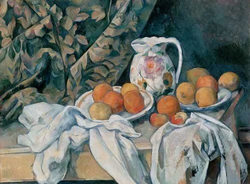
This is a Cezanne still life, see if the notan demonstrates the principles mentioned above. Create a 2-tone notan for the images belowthat. then find some more artworks to study in this way. Deconstructing a painting into a 2-tone notan or imagining one for a reference is great practice (the last thing you want to do is simply copy the value pattern from a photo and not create your own design. To make unique and strong compositions, a well thought-out compositional plan including the notan is vital.

BELOW ARE A FEW, AND FIND SOME MORE REFERENCES TO PRACTICE NOTAN STUDIES
IDEALLY, YOU ARE CREATING A NOTAN STUDY FOR YOUR UNIQUE ARTWORK, NOT REPEATING A VALUE PATTERN THAT IS RANDOMLY FOUND IN A PHOTO OR ANOTHER ARTWORK.
THIS VALUE PATTERN OR NOTAN WILL BE AN IMPORTANT PART OF YOUR OVERALL COMPOSITIONAL PLAN


Go through these sections one by one, using the image links in this Value, Light and Shade Master Index

Video - Tone,contrast,light and shade

Shadows

Light and Shade Exercises

Notan Studies

Common Uses for Value in art

Value Perception

Chevreul's Laws of Simultaneous Contrast

What is squinting at art all about?

Values and Colour Mixing

Using Light & Shade in paintings

Contrast - all forms

Blending / Value Modelling in acrylics