
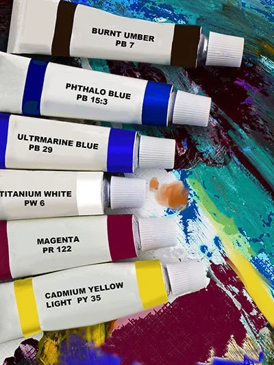
THIS IS SOME GREAT MIXING PRACTICE BEFORE ATTEMPTING YOUR FIRST COLOUR WHEEL
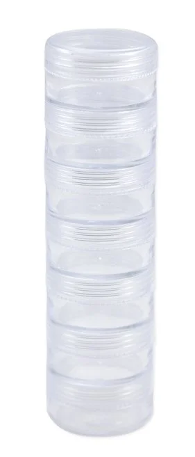
Our students mostly start with 6 basic tubes, bottles or pots. As you learn to make your own secondaries and tertiaries, find some small airtight containers (suggestions on that page for custom paint storage) and keep the final mixes (as you have also learned to test them) against their partner / complement. They make sure that they have a great mixing partner for each hue when it comes time to use a harmonious shadow colour or create unique, fabulous harmonious colour schemes that include a sophisticated well-planned range of saturations, tints and shades. No need to struggle along making muddy mixes and getting frustrated!!
If learners rely on the random collection of paint ‘kit colours’ to try and make shadow colours and harmonise, multiple insurmountable struggles will arise (probably the number one reason for DIY learners to crash and burn while trying to mix colours. They assumed that a kit would have a great range suited to mixing and making everything they needed.
Sadly, not so. They are often tinted, full of fillers and impossible to make dark values with. They usually only have a tertiary red (Red-orange), which makes very dull violets because of the orange bias. They have light ‘burnt umbers’ which fail to make a natural black that is reasonably dark. Life as a colour mixer is tough with a cheap beginner paint ‘kit’.
It is better to buy the basic 6 standard tubes (eg. hues shown) from a cheaper supplier and choose the pigment numbers wisely. Otherwise if budget is not a concern, it is still best to get just these 6 (from Golden, Atelier, Winsor and Newton etc) because you need to learn how to make secondaries and tertiaries and how to harmonise them. Later you can buy convenience colours and know how to best use them in relationships.
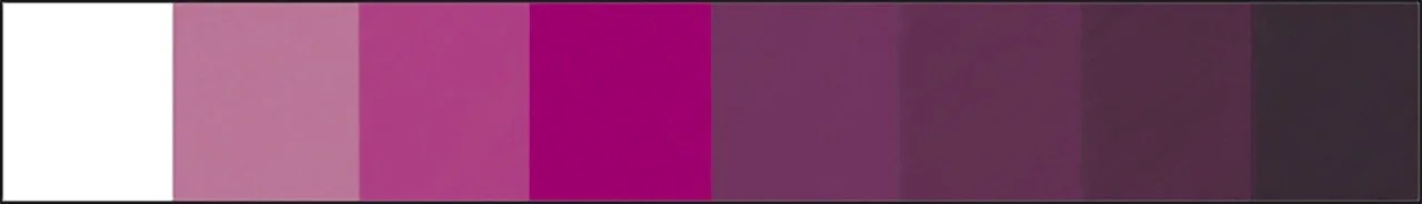
A ‘string’ is commonly made by mixing gradations of white into a hue, resulting in successfully lighter tints of the hue. We can also make gradations of shades (chromatically by adding the perfect complement, or by adding a natural chromatic black)
EXAMPLE OF MIXING A STRING OF TINTS AND THEN A STRING OF SHADES
IN THIS CASE COMPLEMENTARY HUES PRIMARY YELLOW AND SECONDARY VIOLET
1. GETTING THE VIOLET JUST RIGHT
2. A STRING OF TINTS AND SHADES FOR PRIMARY YELLOW

The 3 extra alternative shades of violet shown in the long image, those were made using a 'natural black' (made with Burnt umber and Ultramarine). Some people use Carbon or Mars black to create dark shades of colour, but they end up quite dead or dull looking, especially in your artwork. This 'Paynes Grey’- type black has all three primaries in it, so it makes a great hack for some rich greys. eg. adding a very opaque yellow to violet is never going to make a dark value of rich grey from violet, so natural black is preferred sometimes in this case.
Whether you want to be painting realism, surrealism, abstract or any other genre, the ability to create a range of values (tones) of a pure hue and also a range of shades of a hue are important skills to develop. Please don’t ever think you need to add black to a colour to darken it. (It is very normal to take a few goes to nail the rich greys but they are worth it!) The old masters often painted a ‘grisaille’ (black and white underpainting) over which they glazed successive transparent layers of colour to end up with a highly realistic image. More importantly, they were able to build a glowing contrast (luminance) that is simply not the same as mixing black or white into the hues to create these subtle gradations.
If you don’t have our Colour Workbook, with ready-made 'string strips' you can draw up your own in your mixed media or cartridge pad. If your printer takes cartridge paper, use that to print the two pages. There is also a page with all printables for colour exercises here.
Download 2 pages of a total of 12 string strips or draw them up on your cartridge pad or mixed media paper. Making these strings with tints and greys is fantastic preparation for making your colour wheels. STRINGS 1 STRINGS 2 (A4 pages)
PRIMARY YELLOW
First, make your complementary colour for the yellow, ie. secondary violet. Use ultramarine blue and primary red (magenta) in amounts that end up making a violet with no obvious red or blue bias. NB. You will know it is a good partner for your yellow when it mixes to a nice neutral rich grey.
TIPS - 🎨 If you get a greenish grey, this means that the violet you mixed has a blue bias ( just remember that green is opposite red on the wheel, so add a tiny bit more red to your violet now, to ‘grey it off' and test again in a new area of palette.)
🎨 If you get a brownish grey, (blue is opposite the browns) so add a tiny bit more blue to your violet mix and then try again in a clean area of the palette (with a clean brush).
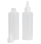
🎨 Once you get a grey-ish hue with no heavy bias towards green or brown, make up at least 20ml of that exact secondary violet, store it in a small jar (OR Squeeze bottle if you are using liquid acrylics) and label it as Secondary Violet. If you are using little screw jars, apply vaseline to each thread, because acrylic paint can tend to glue the threads together.
🎨 Violet, Red-violet and Blue-violet can all appear harmonious included with yellow in a scheme, but only the true secondary violet for your yellow is going to make the nice rich shadows for primary yellow subjects. (or you can take the less chromatically clean way of making shades with your natural black (see the Convenience colour mixing suggestions)
🎨 Always add tiny amounts, mix, test and repeat until you get the grey you are aiming for
PRIMARY YELLOW
SECONDARY VIOLET
While you have your violet mixed to make the yellow string, make a string for the partner violet as well.
If your yellow makes a rich grey with our violet that is not dark enough for your purposes, try adding
successive amounts of ‘natural black’, made with ultramarine blue and burnt umber (needs a dark burnt umber of course).Some cheaper brands don't give a very dark burnt umber.

TERTIARY YELLOW-ORANGE
This is your complementary colour for Blue-violet, so do these at the same time. It is a great idea to make up a small batch once you have discovered the perfect balance of each (use screw jars fo heavy body paint, if you are working in liquid acrylics, the little squeeze bottles are best for your new mixes.

TERTIARY BLUE-VIOLET

PRIMARY BLUE - CYAN

SECONDARY ORANGE


TERTIARY RED-ORANGE

TERTIARY BLUE-GREEN
SECONDARY GREEN

PRIMARY MAGENTA
So if you chose a magenta with minimal violet bias, this kind of green directly above will make a nice grey. If you have a more orange-biased red (only) like a cadmium or naphthol crimson, you will need to add some more blue to that green, since blue-green is opposite tertiary red (choosing your basic primary pigments is often done before seeking out classes or tuition, so don't stress, it is just a matter of finding the happy partner for your red. You can get a Magenta later or never, depends if there are schemes you want to plan that would look best with Magenta included).
TERTIARY RED-VIOLET -The complementary colour of red-violet is yellow-green. They are both tertiary hues and both contain blue so if your greys are brownish, some blue could be added to either or both for the partnership to be good for neutral shades
TERTIARY YELLOW-GREEN -The complementary colour of red-violet is yellow-green. They are both tertiary hues and both contain blue so if your greys are brownish, some blue could be added to either or both for the partnership to be good for neutral shades


CREATING STRINGS OF TINTS AND SHADES
Go through these sections one by one , using the image links in this Colour Master Index

What is Colour Anway?

Colour vs Hue

What influences colour?

Mixing colour strings of tints and shades

Mixing Colour Wheels

Mixing Convenience Colours

Colour Harmonies

Make a Harmonious Scheme selector

Printable templates for colour exercises