
ConveniEnce Colours - What are they?
These are mostly pigment colours made up of more than one pigment.
The names are generally made up by paint manufacturers and are used by others with slightly different mixtures and differing resultant colours. The negative issues they could give are two-fold. Firstly, a favourite colour can be fugitive (not lightfast) because one of its pigment ingredients is not lightfast. Secondly, once another colour is added, things can get muddy very quickly. The positive aspect of convenience colours is the time they save you in mixing your favourite tints, shades, neutrals etc. (so make your own in a reasonable quantity, proportionate to your own general needs.)
Here are some common reasons to want to buy an expanded range of colours and/or convenience colours (to build on your basic starter kit of 6).
1. You are mixing & using it enough to warrant a pot or tube of its own (rather than mix single-use amounts every time from primaries.)
2. You have a healthy budget and prefer never to have to mix them each time. (but you have made them enough times, know how to make them easily and where they fit on, around and across the wheel, which colours they are related to and how to partner them off well in harmonious schemes for your paintings.)
3. You are ready to use transparent versions of some colours - glazing is a great technique to add luminance over white, transparent shadows and more. You'll need a yellow, a red and a blue in the transparent form to be able to make a transparent mix of all secondaries and tertiaries.
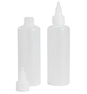
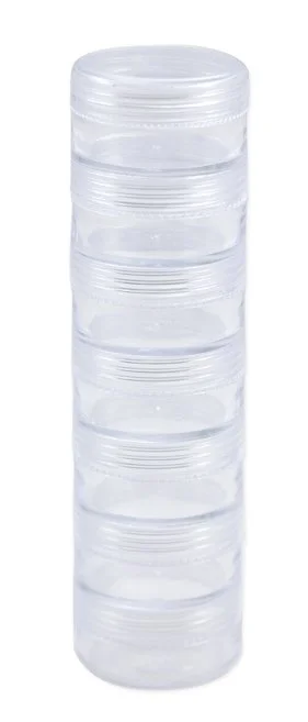
You could also buy airtight small jars for heavy-body acrylics (or squeeze
bottles if you are using liquid acrylics) and make some secondaries and
tertiaries, tints and neutrals of your own and keep them ready. If you are
working in watercolours, get an icecube tray and make some pans
of secondaries, tertiaries and other convenience colours you may want. For oils, there are empty tubes available online, so if you really want to make your own mixes you can store them in these (for oils I prefer to mix each time and buy more hues ready-made.
MIXING A FEW COMMON CONVENIENCE COLOURS
(here are just one way to mix some of them, there is more than one way and each manufacturer has their own mixes) Watch some brief videos of mixing some common Convenience colours.
‘PAYNES GREY’ OR NATURAL BLACK - a very dark grey or natural black (sometimes with a slight blue bias)

William Paynes himself used Iron blue (Prussian Blue), Yellow Ochre and crimson lake in the late 1700s. Manufacturers today each use their own cocktail of pigments. We make a natural black with burnt umber (unless it is a cheapy brand in which case it may not be dark enough)and a nice untinted ultramarine blue.
Earth colours
BURNT SIENNA
Meaning: A traditional pigment name, a reddish-brown pigment produced by roasting sienna (PBr 7)
sienna (an earth colour containing ferric oxides; used as a pigment). Venetian red is a traditional pigment name and is also from ferric oxides but not so 'burnt or dark brownish
How to make this hue with basics: make a dark reddish orange with your red and yellow and add a touch of ultramarine blue PB62 (or ‘Paynes Grey’- natural black) . If you keep adding natural black, it will give a hue like Burnt Umber.
Good Transparent version of this hue: Red transparent oxide PBr 101 or (transparent burnt sienna, Golden)
Not every paint manufacturer offers transparent pigments.
RAW UMBER
A traditional pigment name, Umber is a brown clay containing iron and manganese oxides (originally extracted in Umbria, in Italy, hence the name.)
Make a similar hue - a small amount phthalo blue with some burnt umber and a touch of titanium white(or as below)
Good Transparent version of this hue: red transparent oxide PBr 101 with a touch of phthalo blue PB15

BUFF TITANIUM
It's difficult to reliably recreate an accident. Titanium Buff was formulated to mimic the look of Unbleached Titanium: it contains a single pigment (Titanium Dioxide - PW 6) that has been chemically bonded with a tiny amount of Iron Oxide (Buff's Colour Index Name - PW 6:1). Different paint companies use multiple pigments to mimic this hue.
Some love it for use in portraiture, seascapes with sand, landscapes
BURNT UMBER
BURNT UMBER is the darker burnt version of umber (varies from brand to brand)
You probably have burnt umber in your basic kit, but if you only have primaries, hopefully, the blue you chose was Phthalo PB15 (red-shade Phthalo)
A Good Transparent version of this dark brown hueCan be made with : Red Pr177 plus a touch of Pthalo blue PB15
** BLACK Do you buy black paint or do you stick to 'chromatic blacks'? These are the natural black-looking hues that you can make yourself with dark complementaries. eg, darkest blue + darkest brown OR dark red + dark green.
The old masters often used black in early layers to build a strong tonal pattern which was enriched afterwards with glazes of colours. (called a ‘Grisaille’ underpainting)
The reason I never include black in a beginner's recommended colours is mainly to help the student learn about mixing rich greys and natural black, but it also saves money in the early days. The impressionists insisted that black should never be used as every shade was a mix of the other colours. In contemporary painting, a black pigment (PBk 7, carbon black or PBk11, iron oxide black) can be handy if you are using a lot of it and want no leanings at all toward warm or cool.
NB. Using black to darken a hue rather than using a dark complementary can give quite a dull result, which is why many figurative painters use cleaner chromatic blacks belonging to the scheme or simply use a dark complementary to create a rich grey or shade colour.
To make a dark brown colour if you have no burnt umber in your kit , you could make a dark orange with magenta and yellow, then neutralize it with ultramarine blue. You could always in a pinch, add black to a cadmium, crimson or napthol (orange bias reds).I recommend getting a good burnt umber (one that is dark), as as it can be used for many things.(see our list of minimum requirements)
YELLOW OCHRE
Yellow ochre is a natural mineral consisting of silica and clay owing its colour to an iron oxyhydroxide mineral, goethite. It is found throughout the world, in many shades, in hues from yellow to brown. Modern artist pigment manufacturers still use this name for the synthetic pigments which are usually an earthy brownish yellow.
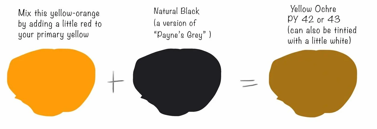
You can mix a similar hue by adding a little of your burnt umber to your primary yellow and a tiny touch of red.
Good Transparent version of this hue: Transparent Yellow Oxide or Transparent Yellow Sienna
Later you may want to place a small dash of all your other new tubes and 'convenience' colours where they belong around and across the wheel. (around the wheel shows the hues, and across is the saturation or intensity.) This pigment mapping can include pigment numbers, brands and mixes
eg you may have a tube of ready-made green, position it relative to the green you make with your primary blue and yellow. This will help you to mix a partner / complimentary colour for it.
INDIAN RED OCHRE
Some artists use Indian red and yellow ochre along with other neutral colours when mixing skin tones. Indian red is opaque and leans more towards red than say, burnt sienna


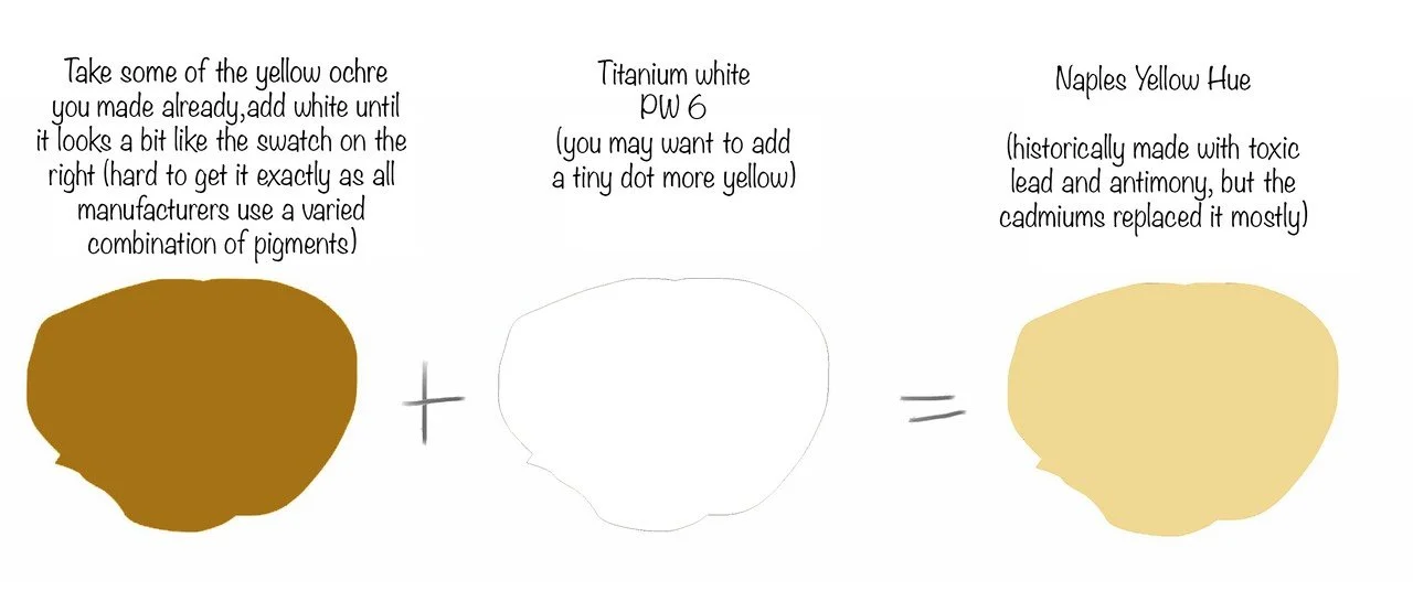
NAPLES YELLOW
Also a popular convenience colour with portrait painters, versions sold now are not the same as the Renaissance painters used.
HOOKER’S GREEN
Hooker's Green is a rich green colour with a yellow-green leaning. A mixed pigment colour, it was originally created by 19th c English botanist illustrator William J Hooker. (WithPrussian Blue and Gamboge). You can make something similar (pigments chosen are transparent as so is Hooker’s green)

Go through these sections one by one , using the image links in this Colour Master Index

What is Colour Anway?

Colour vs Hue

What influences colour?

Mixing colour strings of tints and shades

Mixing Colour Wheels

Mixing Convenience Colours

Colour Harmonies

Make a Harmonious Scheme selector

Printable templates for colour exercises