

When planning the composition for a drawing or a painting, it is essential to consider the background as an integral element of the overall design. Even the negative background if left empty is an influence to be considered right from the start, as positive and negative shapes within a composition can work together or detract.
Below I will be using examples of many considerations that an artist may ponder regarding the background for their composition.
GENERAL TYPES OF BACKGROUNDS
• Empty Background
• Vignetted
• Simple and minimalist
• Somewhat detailed
• Background is the main subject
1. Empty Background ☞ Some drawings and paintings stand alone very well with absolutely no detail in the background.
Plain white, black or one colour of the substrate is most commonly used in portraits and illustrations..
BACKGROUNDS

2. Vignette ☜ a degree of the background is hinted at, but only to focus attention on the main focal point, with blank areas around the periphery
DICTIONARY: (Vignette) - an engraving, drawing, photograph, or the like that is shaded off gradually at the edges so as to leave no definite line at the border.

3. Simple and reasonably plain - ☞ a series of coloured tones but no detail: A student who loves tango found a pose she liked, created her own dancers, and chose a simple background that implies two planes, floor and wall, divided by a darker line.

4. More detailed -☟ some detail, such as objects, foliage, lines, shapes, textures etc that participate in the visual story, hopefully arranged with respect to proportion,perspective and relative contribution to the gestalt (whole).
In the first example, the student has created a soft focus background and a very textured barky tree for the sleepy leopard, not overly detailed but enough of a contrast in texture and detail to give us depth perspective.
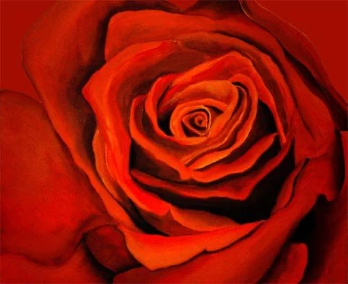
5. Background is THE MAIN SUBJECT
In this outback waterfall scene, although the tree is almost like the narrator of the story, the main subject is clearly the waterfall in the background, the prima donna surrounded by her cast and crew. If anything could try to fight for background status it would be the tiny corner of sky, which does give a nice temperature balance and reflects down into the foregound water as well, further enhancing the viewer’s journey within the art work.
Another more absolute example of the subject taking the background position is in a closeup like these flowers below.

SO WHAT MAKES A GOOD BACKGROUND?
Basically, let’s narrow it down to three influencing factors
The background is not competing with the main elements of the composition.
The background actually complements and enhances the overall image
The background is homogenous and unifies the composition, e.g. a small amount of colour from the foreground (albeit adjusted for aerial perspective) in the sky or vice versa.
1. Complements and enhances, for example: the hills and distant trees serve to guide the eye throughout the scene without competing with the old tree.

AT WHAT STAGE DO YOU PONDER THE KIND OF BACKGROUND THAT WILL WORK BEST?
While you are doing your pre-compositional shape studies, colour relationship planning and notan plan, considering the background and its participation needs to be done together within these planning stages.
This is not to say that you cannot or will not make adjustments to the background as you go along, depending on the development of the whole arrangement.
In acrylic or oils, I usually suggest priming in a mid-tone or light to mid-tone, something that will compliment the finished work and balance your lights and darks against this as well as your colours as you add to the block in and subsequent refining layers. Work from large shapes first down to smaller details within them. Which medium you are using will also dictate to a degree, how much of your background you build in at which stage.(eg. in watercolour you are going to need to pre-plan values, textures and colours of the background thoroughly as of course you won’t be able to just paint over what you don’t like.)
BACKGROUND BOO-BOOS TO WATCH OUT FOR
As you are planning, think about some of these common accidental issues that can spoil a background
The background is too strong in values, contrast, saturation or detail and jumps forward or dominates the focal point competing for attention with the foreground
There’s a mark or obvious mistake in the background that draws the eye straight to it
The colours of the background don't marry well with the subject and disconnect the flow of the visual story
There may be a very large unbalanced area of boredom that prevents the flow of the composition (as opposed to a reasonable area of rest which can be included carefully to relieve the busy-ness)

BACKGROUND LIGHTING CONSIDERATIONS
While you are considering the background as a part of the whole, make sure you take it into account and establish a consistent light source.
- From what direction is the light source? Is it going to be a high-key or low-key work i.e. well-lit or a darker description?
- what is high or low key you ask? A high-key work means that the range of tonal values tends to be closer together in this kind of image, whereas you have a greater extreme of lights and dark in a low-key work. (eg. chiaroscuro). A clever artist knows how to adjust the background areas as well to allow the various parts of a subject to show well e.g. lighten a background area behind a dark edge or vice versa.
CONCLUDING….
Although we are always busting to get to the subject or focal point, it really pays well to give a lot of thought and pre-planning on how the background will contribute to the overall composition of your artwork.
COMPOSITION & DESIGN INDEX , Essentials , Elements & Principles, Fibonacci & Friends,Compositional Considerations , Video, Backgrounds, Perspective